A Tool that Makes it Easy to Find the Course You Need
2020
PTC University
Visual Design/UI
User Research
Prototyping
User Experience
Background
PTC University's primary business is conducting in-person and virtual courses for people to learn how to use PTC Products. We needed a one-stop shop to display the course catalog and allow users to sign up for classes that suit their needs.
My role
I was the User Experience Designer on this project.
My responsibilities included:
Create Low-Fi sketches and wireframes
High-Fi mockups and prototypes
Collaborate with engineers and business stakeholders
Lead user research strategy
Create and establish components for the platform
Contribute to feature backlog and prioritization
PTC University's training business relied on an outdated web page for customers and prospects to view upcoming training classes. The look and feel needed an update, but there were also changes to PTC University’s business offerings that were not accounted for on the old webpage. This confused customers and created a gap in exposure and revenue. In addition, the page was difficult to find and had general usability issues.
The Design Process
I worked collaboratively with the Product Management Fellow to create design requirements for this project.
The experience needs to include our new courses with relevant details to prospects.
Users need to find classes based on their specific needs, such as language, region and time zone, class preference, and product.
It should be easy to find and discover this page.
Next, I began early design exploration focused on wanting our users to discover courses based on their needs, so I started designing how they could narrow their search via filters.
We released our first iteration to work towards increasing revenue immediately. This allowed us to start gathering data and help us understand user behavior. We released the ability to search the course titles, filters, sort, and course cards.
After the initial launch, the team had the opportunity to conduct guided user research to receive qualitative data. The power of both quantitative and qualitative data enabled us to make user-driven decision-making for follow-on iterations.
Our research goals
Identifying if the interface was intuitive
Determining if terminology resonated with the users
Observe if users can easily find the page & find specific classes on the page
Research takeaways
#1 Pain Point
The terminology and phrasing of some of the filter labels did not make sense to participants.
Solution: We found our demographic was more interested in the class length. Although Learn Session and Public Classroom did imply length, the choice of terminology did not communicate that to the users. Therefore, changing the terms to match the user’s needs by focusing on the duration was preferred.
Outcome: Filter usage increased by 58%
#2 Pain Point
The complexity of the region filter was not necessary for our persona. The nature of the business was moving primarily virtual, therefore users did not need to define their location.
Solution: We had to rework our designs to match the updated business model to move from in-person to virtual courses.
Outcome: Reducing the number of clicks to get a location filter and simplifying the UI aligns with our business model.
#3 Pain Point
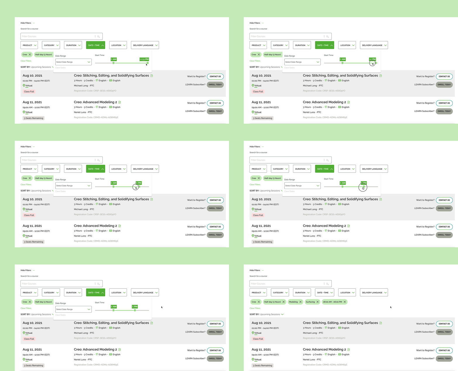
The ‘day of the week’ option is not helpful for participants. Participants revealed that finding a class for their time was a high priority
Solution: We replaced the day-of-the-week filter with a time filter.
Outcome: Users can narrow down classes based on their time preference. The filter & the class listings automatically update to the user’s time zone, so they don’t have to worry about any time change.
#4 Pain Point: Participants revealed scanning the page is difficult because class details were collapsed by default.
Solution: All relevant details were removed from the accordion menu and displayed on the page load. The page is now easily scannable, and users do not have to work to find additional information.
Outcome: Overall task completion rate increased by 41%.
The final designs included recommendations from user research, modifications to the filters, and enhancements to the class listings.
Update the class listing hierarchy and visual design modifications to the list style.
Updates to Filter UI Design to fix mobile responsive behavior.
A chip displaying the remaining number of seats left in the course to create an urgency for sign-up.


